Stress stacks up through micro-moments—notifications, cluttered visuals, harsh lighting, loud interfaces. Color is one of the quietest ways to push back. It doesn’t interrupt you or demand willpower; it simply “sets the weather” of a space. When you choose calmer palettes—soft blues, desaturated greens, gentle neutrals—you lower visual noise, support steadier breathing, and make rest and focus more available by default.
This guide distills what designers, clinicians, and human-factors researchers consistently observe: color influences arousal and attention. We’ll translate that into practical, evidence-aware choices for rooms, wardrobes, digital screens, and everyday objects, with ready-to-use palettes (HEX codes included), lighting guidance, accessibility notes, and step-by-step plans—so you can implement changes today.
How Color Touches the Stress System (Without Magic)
Color isn’t mind control; it works through several grounded pathways:
- Physiological arousal: High-saturation, high-contrast reds/oranges can increase alertness and heart rate; lower-saturation cool hues (blue/green) tend to dampen arousal. The effect is small-to-moderate and context-dependent, but real enough to harness in daily environments.
- Perceptual load: Highly saturated, clashing palettes and busy patterns create visual noise, increasing cognitive load. Softer, harmonious palettes reduce that load, freeing attentional bandwidth.
- Associative memory: Colors carry learned meanings (sky/water = safety, foliage = restoration, warning red = urgency). Calm palettes often piggyback on familiar “safe” associations.
- Light + surface interaction: Color reads differently under warm (2700–3000K) vs. cool (4000–5000K) light, matte vs. glossy finishes, morning vs. evening sun—changing how stimulating the space feels across the day.
Bottom line: color can nudge your stress physiology and attention in your favor, especially when combined with lighting, materials, and clutter reduction.
Evidence Snapshot (What Holds Up, What Doesn’t)
- Consistent trend: Cool, low-saturation hues (soft blues/greens) generally calm; warm, high-saturation hues (vivid reds/oranges) generally activate.
- Context matters: A muted terracotta can feel cozy in a living room but agitating in a focus-critical workspace if paired with high contrast and glare.
- Individual & cultural differences: Personal history and cultural color meanings can flip responses. Always test in your own space.
- Layering works best: Paint alone helps, but the additive effect of textiles, art, plants, and lighting is stronger.
- Digital exposure counts: You likely stare at screens more than walls; calming themes/wallpapers can reduce micro-stress across hours.
Use color as a probabilistic tool, not a universal rule.
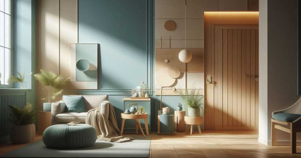
The Calming Color Families (and Why They Work)
A. Blues (air & water cues)
- Range: powder blue → slate → misty gray-blue
- Tends to lower arousal, supports steady breathing and focus
- Great for bedrooms, study nooks, reading corners, clinical waiting areas
B. Greens (biophilic & recovery cues)
- Range: sage → moss → eucalyptus → olive gray
- Signals foliage, safety, recuperation; versatile across rooms
- Excellent for living rooms, offices, therapy rooms
C. Neutrals (low contrast, low noise)
- Range: soft white, greige, oatmeal, warm stone, mist gray
- Provide a quiet base; won’t fatigue the eye
- Good everywhere, especially in small spaces
D. Lavender & Dusty Mauves (gentle warmth without urgency)
- Range: heather → wisteria gray → dusty mauve
- Can soothe without the coolness of blue; nice for bedrooms and baths
E. Desaturated Warm Earths
- Range: mushroom, putty, driftwood, pale clay
- Add comfort without the intensity of saturated reds/oranges
What to minimize in high-stress zones: highly saturated reds, neon accents, black-white high-contrast stripes, glossy finishes that produce glare.
The Three Levers: Hue, Saturation, Brightness
- Hue (the “family”) sets the emotional direction (blue vs. green vs. lavender).
- Saturation (intensity) drives arousal. Lower saturation = calmer.
- Brightness (value) shapes openness vs. coziness. Mid-light values feel calm and grounded; very bright can feel sterile; very dark can feel heavy.
Quick rule: Cool hue + lower saturation + mid-light value = calming, all else equal.
Light: The Multiplier You Can’t Ignore
- Color temperature:
- 2700–3000K (warm): cozy, evening-friendly, reduces harshness.
- 3500–4000K (neutral): balanced daytime function.
- 5000K+ (cool): alertness; use selectively in task areas if needed.
- CRI (Color Rendering Index) ≥ 90: more accurate colors, less visual strain.
- Diffuse > direct: frosted shades, lamp shades, wall washes reduce glare.
- Daylight: pair cool hues with warmer bulbs at night to avoid chilliness.
Materials & Finish: How Surfaces Change the Mood
- Matte/eggshell finishes reduce glare and visual noise (calmer).
- Satin/semi-gloss add reflectivity (can feel “busy”); reserve for trims.
- Natural textures (linen, wool, uncoated wood, clay) absorb light softly and align with calming palettes.
- Metallics: keep subtle (brushed brass, muted nickel) rather than mirror-like chrome.
Cultural & Personal Nuance
Color meanings vary. White may signal purity in one culture and mourning in another; green may be auspicious or neutral. Personal history trumps general rules: if ocean blue reminds you of a bad storm, it won’t soothe you. Always sample & self-test.
A Simple Self-Test to Find Your Calm
- Collect 8–12 swatches across blues/greens/neutrals/lavenders (low saturation).
- Tape them near eye level on the wall you face most, plus a corner that gets different light.
- Observe for 3 days at morning, afternoon, night.
- Journal fast reactions: breath, posture, urge to tidy/linger, eye comfort.
- Shortlist 2–3 that consistently feel easiest on your eyes and body.
- Paint a 60×60 cm test patch of the finalists. Live with them for a week.
- Decide with lighting on/off; include fixtures you actually use.
Ready-Made Calming Palettes (HEX Included)
Use these as whole-room schemes or pick one wall color plus 2–3 textural accents. Keep contrasts gentle.
Palette A — Coastal Quiet (Blue-Green Neutral)
- Wall: Mist Blue
#CFE3F1 - Trim/Ceiling: Soft White
#F6F6F3 - Accent 1: Sage
#B8C7B0 - Accent 2 (textiles): Driftwood
#A89F93 - Deep anchor (optional): Slate
#5E6B74
Palette B — Sage Retreat (Green-Neutral)
- Wall: Sage
#BAC8B8 - Trim: Warm White
#FAF7F1 - Accent 1: Eucalyptus
#A5B9A3 - Accent 2: Sand
#D5C8B2 - Deep anchor: Forest Gray
#56665C
Palette C — Lavender Haze (Cool Warmth)
- Wall: Heather
#D9D3E6 - Trim: Porcelain
#FFFFFF - Accent 1: Dusty Mauve
#C9A8B8 - Accent 2: Pebble
#B7B7B2 - Deep anchor: Charcoal Plum
#5B5661
Palette D — Nordic Calm (Soft Neutrals)
- Wall: Oat
#E7E0D2 - Trim: Cream
#F8F4EA - Accent 1: Putty
#CBC4B9 - Accent 2: Sea-Gray
#BFC7C8 - Deep anchor: Graphite
#505457
Palette E — Biophilic Blue-Green
- Wall: Glacier Blue
#D4E6EB - Trim: Linen
#F3EFE6 - Accent 1: Moss
#9DAF9E - Accent 2: Reedy Beige
#D6CEBF - Deep anchor: Riverstone
#6E7B77
Palette F — Minimal Zen
- Wall: Fog
#E6E8E8 - Trim: Cloud
#FCFCFA - Accent 1: Soft Taupe
#CFC6BD - Accent 2: Ecru
#DED6C8 - Deep anchor: Blue-Gray
#6F7C86
Palette G — Desert Dawn (Muted Warm)
- Wall: Pale Clay
#EBDCCF - Trim: Ivory
#F7F3EA - Accent 1: Mushroom
#BFB5A8 - Accent 2: Dust
#CBBEB1 - Deep anchor: Olive Gray
#6B6E62
Palette H — Studio Focus (Cool Neutral)
- Wall: Silver Sage
#C7CEC9 - Trim: Crisp White
#FFFFFF - Accent 1: Steel
#A4ADB3 - Accent 2: Ash
#C9C6BF - Deep anchor: Ink
#3F4850
Room-by-Room Calm
Bedroom:
- Primary wall in Mist Blue or Sage; keep contrast soft.
- Textiles: linen duvet in Oat, throw in Dusty Mauve or Moss.
- Lighting: warm 2700K bedside lamps with fabric shades.
- Avoid: glossy headboards, busy patterns near the pillow line.
Living Room:
- Walls in Oat or Fog; one accent in Eucalyptus or Driftwood.
- Use plants to reinforce green cues.
- Keep metallics brushed, not mirror-polished.
Kitchen:
- Base: warm neutrals; add Sage on cabinetry for softness.
- Avoid stark black-white checkerboards; use small-scale, low-contrast patterns if any.
Bathroom:
- Lavender Haze or Glacier Blue for spa-like calm.
- Matte or honed tiles; soft white light around mirrors to reduce harsh shadows.
Workspace/Study:
- Studio Focus palette; wall behind monitor in Silver Sage to reduce eye fatigue.
- Task lights at 3500–4000K; diffuse ambient light.
- Keep shelves low-contrast and organized.
Entryway:
- Sage Retreat or Minimal Zen to set the tone; add a natural fiber runner (jute/wool).
Micro-Environment Hacks (Big Gains, Small Moves)
- Device themes: switch to low-contrast, blue-green or neutral system themes; dark mode with slightly warm tint at night.
- Wallpaper: choose misty landscapes, blurred foliage, water textures (low detail).
- Stationery: notebooks in sage/stone; avoid neon tabs.
- Hydration cues: pale glass or ceramic bottles in foggy hues instead of plastic neons.
- Clothing: for high-stress days, lean into desaturated blues/greens/earths; reserve bold reds for short “performance bursts,” not all-day wear.
Accessibility & Wellness by Design
- Contrast balance: calming ≠ illegible. For signage/UX, target sufficient contrast ratios while avoiding harsh black-white extremes.
- Neurodiversity: many autistic and ADHD individuals report comfort with solid, desaturated fields and predictable patterns; avoid flicker/glare.
- Aging eyes: slightly warmer neutrals improve visibility and comfort; choose matte finishes to limit glare.
- Scent & sound: color is one layer. Pair with quiet acoustics and neutral scents to avoid sensory overload.
Common Pitfalls (and Easy Fixes)
- Choosing from a phone screen only: colors shift on screens. Always use physical swatches and paint samples.
- Ignoring light: test your finalists morning/noon/night with your actual bulbs.
- Too many accents: 1–2 accent colors, keep saturation low.
- Shiny everything: limit gloss to trims/hardware; prefer matte/eggshell for walls.
- High-contrast art clusters: use soft mats/frames; group by similar value to reduce noise.
Biophilic Boosts (Color + Nature)
- Add actual plants to reinforce green cues and micro-restoration.
- Use natural wood in mid-tones (oak, ash) rather than high-contrast stains.
- Nature-textured fabrics (linen, cotton, wool) absorb light softly.
Paint & Product Shopping Checklist
- Swatches: 8–12 in your target family (cool/neutral/desaturated).
- Finishes: matte/eggshell for walls, satin for bath/kitchen, semi-gloss for trim.
- Bulbs: 2700K for bedrooms/living; 3500–4000K for work areas; CRI ≥ 90.
- Test pots for top 2–3 colors; paint 60×60 cm near main light sources.
- Clean lines: painter’s tape, drop cloths, low-VOC paint.
Digital Life: Calming UX in Your Pocket
- System settings: reduce saturation with “color filter” tools; enable Night Shift/blue-light reduction after sunset.
- App themes: choose “nature,” “ocean,” or “sage” palettes; avoid pure white backgrounds at night (use light gray).
- Browser: simple start page with soft-tone background; minimal bookmarks bar.
- Notifications: color-code only critical alerts; keep others neutral or off.
For Teams & Shared Spaces
- Consensus palette: choose a neutral base (Fog/Oat) + one cool accent (Sage/Glacier Blue).
- Zoning: focus zones in cool neutrals; collaboration zones get slightly warmer desaturated accents (Pale Clay).
- Brand alignment: interpret brand colors as tints or grayed versions in walls/furnishings, keep full-saturation hues for small wayfinding elements.
Special Populations
- Children: keep saturation a notch higher than adult spaces but still moderate; favor mid-value greens/blues; avoid wall-to-wall neon.
- Elders: warmer neutrals, high-CRI lighting, low glare, simple patterns.
- Anxiety/Panic prone: avoid high-contrast black-white, red-dominant schemes; lean into greens and soft neutrals.
- ADHD: consistent color fields behind task areas; gentle contrast to separate zones; predictable textures.
Measure Your Calm (So You Know It’s Working)
- Subjective: daily 1–10 stress rating morning/evening for 2 weeks pre-change and 2–4 weeks post-change.
- Behavioral: sleep onset time, time-on-task, clutter rebound (how fast mess accumulates).
- Physiological (optional): smartwatch HRV trends, resting heart rate; compare weekly averages.
- A/B test: one room updated vs. a matched control room for 2 weeks.
Look for trends, not perfection.
Budget Pathways
- Start with textiles: curtains, throws, cushion covers in Moss, Fog, Sage.
- Swap lamp shades to fabric diffusers; change bulbs (cheap, high impact).
- Use peel-and-stick wallpapers or large canvases painted in your chosen hue as “color panels.”
- Refinish small furniture with chalk-matte paints in Driftwood or Putty.
One-Day Mini-Makeovers (Step-by-Step)
Bedroom reset
- Replace bulbs with 2700K, CRI ≥ 90.
- Add linen duvet in Oat; two pillows in Moss; one throw in Dusty Mauve.
- Declutter surfaces; add one plant.
- Set phone to night theme + soft wallpaper.
- Optional: paint headboard wall in Mist Blue.
Desk detox
- Wall behind monitor: Silver Sage board/panel (peel-and-stick or painted MDF).
- Matte desk mat in Ash; fabric shade task lamp 3500K.
- Reduce icon colors; neutral desktop.
- Small plant to the periphery (not in central view).
Quick Reference: Do/Don’t
Do
- Choose cool/desaturated hues in mid-light values.
- Diffuse light, matte finishes, natural textures.
- Limit contrast and saturation in large fields.
Don’t
- Overuse neon or highly saturated reds/oranges.
- Ignore lighting and finish.
- Mix more than 2–3 accent colors in a small room.
Frequently Asked Questions
Q: Can a warm palette be calming?
Yes—if it’s desaturated and low-contrast (e.g., Pale Clay + Mushroom + Linen).
Q: I love red. Is it banned?
No. Use red as a small accent (book spine, small vase) rather than a wall color in high-stress areas.
Q: What if my rental forbids painting?
Lean into textiles, art panels, lightbulb swaps, removable wallpaper, and screen themes.
Q: Will this fix my anxiety?
Color won’t replace therapy, sleep, or medical care—but it reduces environmental load, making everything else easier.
24) Putting It All Together (A 7-Day Plan)
- Day 1 – Audit: Identify your highest-stress room; photograph at morning/noon/night.
- Day 2 – Swatch: Pick 10 low-saturation candidates across blue/green/neutral.
- Day 3 – Test: Place swatches; choose 3 finalists.
- Day 4 – Light: Replace bulbs (per room function) and add diffusion.
- Day 5 – Textiles: Introduce two calming textiles and one natural texture.
- Day 6 – Paint/Panel: Paint a feature wall or add a large removable panel.
- Day 7 – Digital: Calming device themes + notification hygiene.
Track stress ratings for the next two weeks; adjust if any element feels dull or heavy (tune brightness upward, add gentle contrast).
Conclusion
When you select calmer colors, you’re not just decorating—you’re editing your nervous system’s inputs. Cool, desaturated hues; soft, diffuse light; matte textures; low contrast; and nature-aligned materials create an environment that lowers visual noise and supports steadier breath, easier focus, and better sleep. Make small, layered moves—swap a bulb, add a sage throw, change your desktop—and you’ll start to feel the compound effect: less irritation, more presence.
Use the palettes above as a starting point. Test in your own light. Keep what feels good; adjust what doesn’t. Over time, you’ll find that your home, desk, and devices stop demanding your attention—and start giving it back.
SOURCES
Al-Ayash, A., Kane, R., Smith, D., & Green-Armytage, P. (2016). The influence of color on student emotion, heart rate, and performance in learning environments. Color Research & Application, 41(2), 196–205.
Augustin, S., & Fell, D. (2015). Place advantage: Applied psychology for interior architecture. Wiley.
Chang, C. Y., & Chen, P. K. (2005). Human response to window views and indoor plants in the workplace. HortScience, 40(5), 1354–1359.
Elliot, A. J., & Maier, M. A. (2014). Color psychology: Effects of perceiving color on psychological functioning in humans. Annual Review of Psychology, 65, 95–120.
Jalil, N. A., Yunus, R. M., & Said, N. S. (2012). Environmental colour impact upon human behaviour: A review. Procedia – Social and Behavioral Sciences, 35, 54–62.
Küller, R., Ballal, S., Laike, T., Mikellides, B., & Tonello, G. (2006). The impact of light and colour on psychological mood: A cross-cultural study of indoor work environments. Ergonomics, 49(14), 1496–1507.
Kwallek, N., Lewis, C. M., & Robbins, A. S. (1997). Effects of office interior color on workers’ mood and productivity. Perceptual and Motor Skills, 85(1), 650–652.
Mahnke, F. H. (1996). Color, environment, and human response. John Wiley & Sons.
Ulrich, R. S., Simons, R. F., Losito, B. D., Fiorito, E., Miles, M. A., & Zelson, M. (1991). Stress recovery during exposure to natural and urban environments. Journal of Environmental Psychology, 11(3), 201–230.
Valdez, P., & Mehrabian, A. (1994). Effects of color on emotions. Journal of Experimental Psychology: General, 123(4), 394–409.
HISTORY
Current Version
Aug 18, 2025
Written By:
SUMMIYAH MAHMOOD